The Food and Drug Administration is proposing changes to the ubiquitous food label. I just got a chance to read the original FDA press release about the changes, and I’m really excited about the direction of the new label.


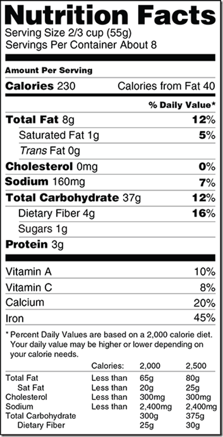
This is what the current label looks like:

ucm387149

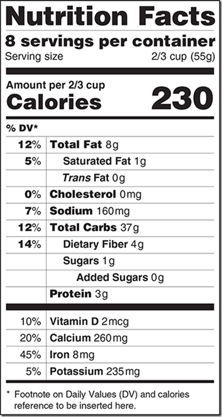
And here are the proposed new labels…


Up first, we have the basic revisions:

ucm387151

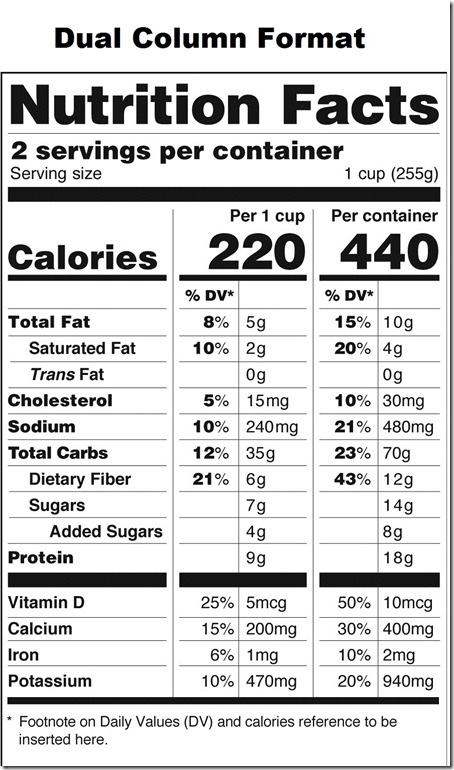
There’s also a proposed Dual Column label:

LABEL_REVISIONS_FINAL4_no_captions

The three biggest differences are:


A more clearly defined number of servings per container.

The font size for the number of calories is drastically larger.

There’s a new line item for “added sugar.”

I’m especially pumped about the the “added sugar” line because this means you don’t have to do as much sleuthing when reading food labels.  Before, if you saw a food had 5 grams of sugar, you had to look at the ingredients list to figure out if the sugar was naturally-occurring (like in fruit) or added in.  Too complex!

Side note:  Did you hear that the World Health Organization just released new draft guidelines about sugar intake? The WHO recommends that people limit sugar consumption (in all forms) to less than 10% of total calorie intake per day but says that below 5% is even better.  According to WHO, 5% would equal about 25 grams of sugar.  Here’s more on the WHO guidelines.

Other changes to the food labels may include:

The label will include amounts of potassium and Vitamin D. These nutrients have been identified as ‘nutrients of concerns’ for Americans; Vitamin D plays a role in bone density and potassium plays a role in lowering blood pressure.  Vitamins A and C don’t have to be on the label anymore.

They are removing the line item for “Calories from Fat” because research shows the type of fat is more important.

Foods that come in multiple servings per package but are often consumed as one serving (i.e. a bag of chips!) may include ‘dual’ columns so you can compare the nutritional information of one serving v. the entire package.

ucm386509

And more!

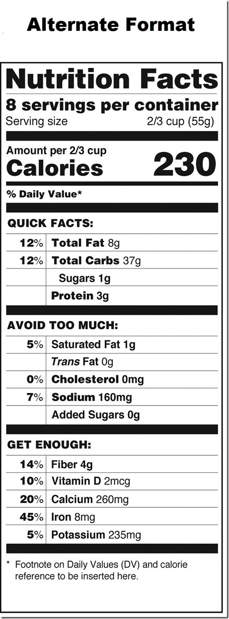
One of the alternate formats to the new label is this design.  As you can see, it divides the label into the following categories:  Quick Facts, Avoid Too Much, and Get Enough.

LABEL_REVISIONS_FINAL4_no_captions

I really, really like this format because I think ‘dumbing down’ the label as much as possible is a great idea.  It should be SUPER simple to read.  With this label, you don’t need to already know that trans fat should be avoided – the label tells you everything.  However, I don’t see this label passing because I can’t imagine that Big Food lobbyists would go for it.  They’re already upset that added sugar is getting called out.

What do you think of the new food label?  Which version would you like to see – the proposed one, the dual column, or the alternate format?   I’d love for registered dietitians to weigh in!  I like the suggested changes a lot, but I guess time will tell what version gets passed.   Side note: if you want to also send your comments to the FDA, this page tells you how to do so.

All graphics courtesy of the FDA.

{ 47 comments }


  • Karen March 10, 2014, 4:54 pm

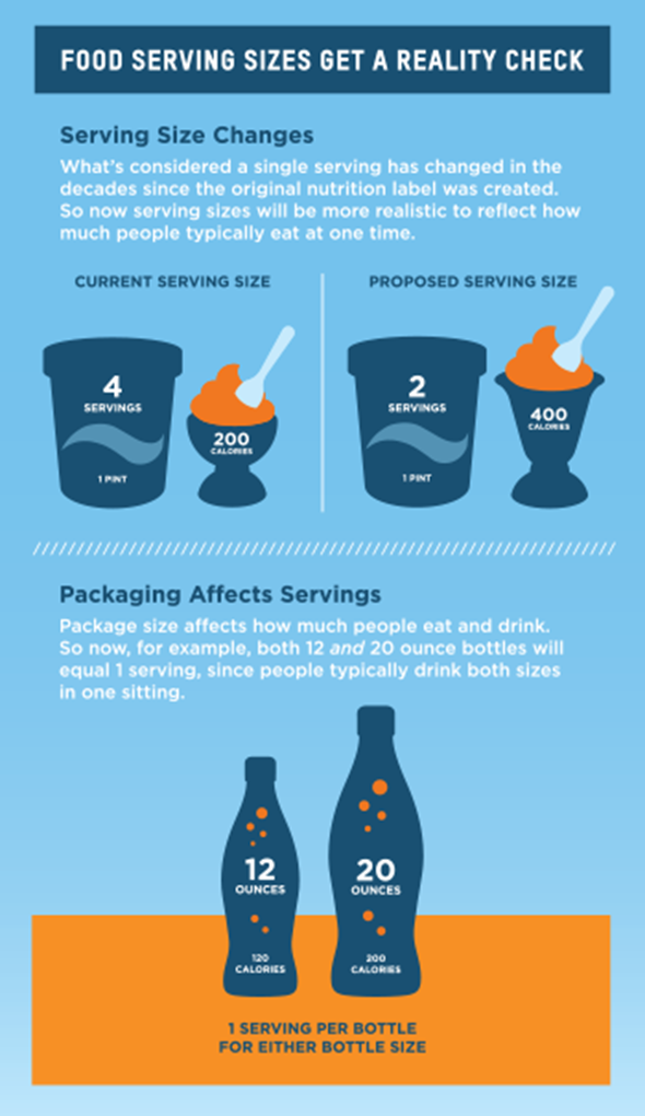
    I’ll say one thing: I DO NOT like the ideas that they might change the recommended serving sizes on packages!

    These WHO or FDA or whatever agency should be offering reasonable, but healthful, suggestions – not reacting to what the typical American eats and changing it based on our bad habits!

    I think it’s VERY LIKELY that if the serving sizes increase, so will American waist-lines.

    • Caitlin March 10, 2014, 4:55 pm

      Good point, I agree.

    • Margaret March 10, 2014, 5:32 pm

      This is what stood out to me, too! The other changes mostly make sense (especially the dual columns for things like pop bottles), but I always thought that the serving size indicated was the recommended serving, not the average serving. Not that I always follow it 🙂 but it’s at least a guideline. Like, if a “recommended serving” of ice cream is 1/2 cup, but I take 1 cup to start with, I’m less likely to go back for more because I know I already had 2 servings in the first bowl. If the label said 1 cup was a serving, because that’s what most people eat, it’d be much easier to justify eating more.

      • emily March 10, 2014, 7:04 pm

        I agree with Breanne (below me). The “recommended serving” usually doesn’t match with the serving for the diabetic exchanges nor the suggested serving sizes based on the My Plate guidelines. Since the manufacturer serving is fairly arbitrary anyway I’d rather it be more realistic.

    • Breanne March 10, 2014, 5:34 pm

      I actually think this is one of the things that I like the most, but I read it in a very different way. I don’t see it as changing the recommendation of a serving size, but as giving the information for how the food is consumed. With the example of the bottle, whether someone gets a 12 oz can or a 20 oz bottle, that person will drink the whole thing as one serving whether the serving size is 8, 12, or 20 oz. I think a transparent label could actually benefit waistlines (like Caitlin’s example of a bag of chips – if a person sees large and bold what is in that bag, maybe he/she won’t eat the whole bag whereas now, if he/she sees the current nutrition he/she might not make the leap to see how many servings are in a bag).

      That said, I like the idea of the dual column. Here’s the recommended serving size (as it’s always been) and here’s the whole bag/container/way you probably actually eat/drink it. Plain and simple and no math.

  • Elizabeth {Positively Healthy} March 10, 2014, 5:22 pm

    I am really really liking the last label. This version would be so understandable to everyone. I know so many people who have no idea what a fat is or a protein is, this would be so helpful to have a clear idea of what is good for you and what is not so good and what you need and what you can avoid! Awesome!

  • Carol March 10, 2014, 5:26 pm

    I like the alternate format because it is easy to read. I don’t like the dual column because I think it made lead people to eat more. If they read that a serving since is the entire container, they will eat it. I work with some people who have this mindset. Curious to see which gets picked.

  • Kirsten @ Fit + Fab March 10, 2014, 5:43 pm

    I’ve been debating about the new labels, but never saw the duel label. I think I like that one the best. It will definitely cause people to not ignore eating a whole container (or at least turn some people off at the sight of some crazy calorie goods)

  • Sam March 10, 2014, 5:56 pm

    I personally like the idea of the double column on the label. Many people I talk to don’t even realize that there is a difference between the serving size on the nutrition label and the total amount per container.

  • Lauren March 10, 2014, 6:01 pm

    I think calories and sugar are the least of our problems when it comes to processed food and they need to worry about labeling GMOs

  • Angela @ Eat Spin Run Repeat March 10, 2014, 6:38 pm

    Interesting – like you Caitlin, I like that they’ve put in the added sugars line, for the same reasons you described. I also think the dual column is useful, especially for people who have trouble accurately estimating how big 1/2 cup, 1 cup etc is. However, I’m not sure I really agree with the decision to emphasize calories, because a food can be incredibly low in calories yet totally devoid of nutrients! Even though there are some good things about this label, I think ingredients lists should still be emphasized just as much, if not more. And they could start with making the text bigger so people don’t have to squint to read it!

  • Sara @ LovingOnTheRun March 10, 2014, 6:51 pm

    I really like what they have done! Yes it is “dumbing” it down but I think that will help a lot of people and avoid them “sneaking” things in to make it seem healthy. I LOVE the added sugars part – that is probably my favorite thing!

  • emily March 10, 2014, 7:00 pm

    As a registered dietitian I love the proposed and the dual column options. I also think it’s great that they are forcing manufacturers to be more realistic about their suggested serving sizes. I always teach my clients to be mindful of the servings per container and total calories based on serving size and the new label will really simply this process.

  • AJ March 10, 2014, 7:17 pm

    I find American food labels quite confusing and I am a trained dietitian! Here in Australia there is always a ‘per 100g’ column as well as a per serve column which makes it really easy to compare products.

  • Janelle March 10, 2014, 7:18 pm

    I hadn’t heard about these changes, but the seem mostly good. In general, I read the ingredient list, but I don’t normally pay attention to the nutrition label. The most nutritious foods tend not to have labels (meaning vegetables and fruits), and I try to avoid the processed stuff as much as possible. I understand how paying attention to calories can be helpful if you are trying to loose weight, but I wish we’d pay more attention to what we are eating, rather than the amount of calories in a serving size – meaning, if you want to eat a whole bag of carrots in one sitting, go for it – better than one serving of chips. But, better labeling can’t hurt either since there will always be processed food consumed!

  • Alex March 10, 2014, 8:01 pm

    I think the double column one is really good – in NZ we have two columns, one is serving size and one is per 100g or 100ml. This is super handy when comparing similar products that have different serving sizes – e.g. yoghurt can be from 100ml to 150ml and cheeses can be 20-30g.

    • Breanne March 11, 2014, 3:54 pm

      I would love if they went this way with the dual column. It’d definitely be helpful if the “recommended” serving sizes were uniform.

  • Traci March 10, 2014, 8:35 pm

    I really like the dual column label; I hope that one ends up showing up everywhere.

  • Liz March 10, 2014, 9:48 pm

    As a Registered Dietitian, I think the dual colum option is asking for the obesity epidemic to continue. Although I believe in informing the public, I don’t think this is the right way to go about it… I LOVE the alternate label. Anything going out to the public should be created at a 6th grade reading level (or lower). I think this label is an amazing way to show the public what is important to limit and what to include more of in their diets. Thanks for sharing this- I’ve read your blog for a few years now and love your posts.

  • Jackie March 10, 2014, 11:27 pm

    I love the added sugar line – but to be clear, is the first one (listed “sugar”) the TOTAL amount of sugar? So, if “sugar” is 7g and “added sugar” is 2g, are there 7 grams of sugar in the whole thing, 2 of which are added? Or are there 9 grams in the whole thing, 7 natural and 2 added?

    When are they making a final decision – does anyone know?

  • Diana Griffith March 10, 2014, 11:42 pm

    I heard of the new serving size rules being proposed, but I didn’t know about the nee labels. I REALLY like the side by side view for things that are typically eaten all at once. I always find it so mileading that a bottle of sods is 2.5 servings but you would normally drink the whole thing.

    Other than that, I’m ok with the first label. I honestly think the last one is a bit too much and may be hard to understand. However, I like the added sugar line. I’m also glad they’re taking away calories from fat. I never understood who used that. I know grams of fat is used more for understanding how much fat is in something.

  • Alina March 11, 2014, 12:16 am

    Love the added sugar addition, it’s always nice to know that what your buying (i.e. juice, fruit snacks, etc.) is more healthful and not just a scam. As crazy as it sounds, I’m not nuts about the huge focus on calories (as important a role as they play) because they don’t paint the whole nutritional picture. I’m not a RD, but from my basic understanding, food can be high in calories from wholesome, nutritional sources (like milk or lean proteins) while simultaneously being high in vitamins, proteins etc. or it can have an identical amount of calories and be full of added sugar, salt, fat etc. This is where I think the “quick facts” and “avoid too much” headings come in handy- if we’re going to emphasize something to create positive change, we don’t want to accidently mislead consumers in the process!

  • Beck March 11, 2014, 4:23 am

    In Australia we use labels like the second proposed label (showing the nutritional intake for 1 serving as well as for the whole product) except we show the nutritional intake for 1 serving and for 100g of the product. I think this label is really helpful, but I like the idea of showing the nutritional value for the whole product instead of working it out yourself (because sometimes I get lazy haha).

  • Verna March 11, 2014, 7:07 am

    I liked the 2nd version of the new label. I liked how it showed the calories, etc. for one serving AND the whole container. I didn’t care for the first version, simply because the percentages being on the left is so different. Obviously, I’d get used to it but I think leaving it closer to the current style but simplifying it would be easier to adjust to. Thanks for sharing! Very interesting!

  • Tara March 11, 2014, 8:44 am

    I like the proposed and dual column the best. For some reason the alternative looks choppy to me and I’d rather have everything just listed out in the row.

    I love that they are considering changing the serving size, because I think it is absolutely ridiculous how small most portions sizes (especially for processed foods) are. I weigh a lot of my food to make sure I don’t go overboard on certain things and it’s amazing how tiny the portions really are. I mean 28 grams of chips/pretzels/crackers is barely a handful. I don’t know anyone who eats a tiny handful of those foods, but they probably feel like a bowl would be about a serving or two…when in reality it’s about 8! I think making realistic serving sizes is much more helpful, rather than keeping portions sizes so small and have people assume they are in line with the serving size and being totally off.

  • Jill March 11, 2014, 8:45 am

    I don’t understand the point about sugar consumption. Wouldn’t your total calorie intake have to be 500 calories in order for 5% to equal 25? I must be missing or misunderstanding something……..

    • Ashley March 11, 2014, 4:23 pm

      25 grams of sugar equals 100 calories (carbs are 4kcal/gram), so that would be based on a 2,000 calorie diet, which is what the labels use. The gram recommendation would be lower for lower calorie diets. To figure out what it would mean for your personal calorie level you would take the total calories, multiply by 0.05, then divide by 4.

  • Laura@SneakersandSpatulas March 11, 2014, 9:10 am

    I’m really excited about the new labels, I think they will help a lot of people! I like the dual format option. And it’s about time they update the ice cream serving size, people do not eat 1/2 cup! It should be 1 cup.

  • Ashley March 11, 2014, 9:24 am

    Registered dietitian here! I am loving the proposed changes, I really hope there are some actual changes made. Personally, I like the dual column label. I’ve noticed a few products already have this, and I think it’s great. I like the alternate format as well, but in my experience people simply don’t read. I know it’s a small label with very little text, but people really don’t even read the whole thing…so while the added words are informative and helpful, they are still added words that most people will just skim over. I think the biggest thing people struggle with is what a serving size is, so having the dual column will be more eye opening for a lot of people, as will having calorie level and serving sizes easier to spot.

    I actually do like that they are changing the serving sizes on some sizes. I think part of the reason my weight loss participants get so fed up with having to keep up with serving sizes is because they feel they aren’t realistic. While I think original sizes are far better, coupled with the proposed changes perhaps people will rethink their original choices altogether. Someone who previously saw that a serving of ice cream is x calories and felt fine consuming it, but accidentally ate TWO servings might think twice about even eating that ice cream if they now see on the label that the calorie level is 2x, know what I mean? For example, have you had Noosa yogurt? I LOVE it, but the container used to be 2 servings. Even as an RD who knows better, I would usually start off eating half, then end up finishing it and think “Oh well, still a healthy snack!” But they changed their packaging and now the entire container is a package, which in practice is FAR more realistic. I still enjoy it, but less often than I used to, because even though I know how to add and figure out the total calories/fat/carbs/protein for the entire package, seeing them on the label made me think twice in a way that common sense didn’t.

    Hope all that made sense! Kinda rambly…haven’t had my coffee yet 🙂

    • Ashley March 11, 2014, 9:31 am

      Hmm…something I didn’t consider until just now, as I sit eating my Chobani Flip, is this – what about labels that aren’t in this format? Many products, like this yogurt, have things just listed out in line format. I hate these labels as they are incredibly difficult to read as they are. I wonder if there would be any regulations requiring labels to include the nutrition information in this format? If not, it seems many products could just change their packaging to not have the box at all.

  • Molly March 11, 2014, 9:24 am

    Dietitian weigh in…
    Take off those darn percentages! They are not helpful.
    Seperate completely the minerals and vitamins.
    I think sugar is just an extra thing to look at and get caught up on. Your gut can tell if something will have sugar in it. If you’re really concerned then divert to ingredient list.
    Usually people just look for “low amounts” and don’t even know how much of something they should be consuming which negates all information listed.
    Less information is more.
    Eat more foods without labels.

  • alan March 11, 2014, 9:27 am

    This is much ado about nothing. I am very skeptical when the government pats itself on the back for doing something big (and I am not one of those hate-government types).

    I just feel that enlarging the same info that is on there now is just a waste of time. Starbucks and Panera and others show calories on their menu and it has not been shown to alter ordering habits (or consumption) according to various news outlets. I think the only positive here is the “added sugar” line. Otherwise, much ado about nothing.

  • Joy Bean March 11, 2014, 10:34 am

    I like the dual column representation because it really does give a person the breakdown of how many calories/fat/sugar/etc. are in a serving as well as in the whole container. I know some people don’t even consider how many servings are in a container, so this would help out a lot.

  • Courtney Leigh March 11, 2014, 10:56 am

    What I like least is moving the DV % to the right. People read right to left, so I feel like it puts more emphasis on DV%, which I have always found the LEAST useful information on the labels because I know very few people (okay, actually none) who eat that 2000 calories a day and keep up with the percentages like that. Does anyone use those percentages? Really?

    • Caitlin March 11, 2014, 2:11 pm

      Good point!!!

  • Reenie March 11, 2014, 11:00 am

    I like the dual label, and def like the “added sugar” line.

  • Anne Weber-Falk March 11, 2014, 11:19 am

    I really like the dual serving labels. That is the realistic view of what that person is consuming. Who divides a 20 oz bottle of soda two and a half ways? Most will consume that entire bottle themselves. I remember the shock I had discovering that Otis Spunkmier chocolate muffin from work was FOUR servings. Knowing what the calories, etc. are in a serving and for the whole package makes me more mindful and careful of how much I eat and I tend to make better choices.

  • Nikki March 11, 2014, 11:43 am

    I like the new labels, especially with the added sugar line. I don’t think that they need to make the font bigger for the calories, becuase I think the nutritional value is more important than calories. Overall, still a change in the right direction.

  • Stephanie @ Whole Health Dork March 11, 2014, 12:36 pm

    I had heard about this last week and enthusiastically taken a quick look. I was so happy to see the changes. I’m relatively savvy when it comes to reading food labels and even I have a difficult time trying to figure them out on occasion. This would be so helpful to everyone, especially the enlarged “servings per container.” I agree with you in liking the last one the best. The more easy you can make it for people to make better choices, the better!

  • Kathryn March 11, 2014, 1:56 pm

    Appreciated your post and comments! Food label was in need of an overhaul—I like the added sugars section. While it is just easy to simply avoid ingredients you can not pronounce (most of the added sugars or preservatives, genetically modified, etc) it is nice to see this clearly laid out!

  • Charise March 12, 2014, 9:12 am

    I lead grocery shopping education tours for a local nonprofit, where how to read food labels and what the key things to look for in different food groups is a big part of it. So I’ve discussed this some. While I understand that many people eat the whole package of things with multiple servings and might not realize how much they are truly taking in, I would MUCH prefer the dual format where you can see the info for a normal serving and the super sized serving if they go that route. I wouldn’t want people to think that the whole bag is a recommended healthy serving! A dual column might actually get more people to realize how much they are eating compared to the recommended amount, but using only the average serving size could have a negative influence.

    I also love, love the alternate format – I hadn’t seen that one yet. But I agree the big food companies would fight it to the end.

  • Shelly March 12, 2014, 2:02 pm

    I like the new format! I’m pretty okay with any of the three. The first time I had seen them I didn’t notice the added sugar and thought the only difference was the calories and calories from fat. Thanks for pointing out the rest!

  • Heather March 13, 2014, 12:02 pm

    I love the new format options, especially the dual column format. Nothing drives me crazy more than standing at a gas station looking for a road trip snack and trying to figure out the nutrition label. Thanks for keeping us updated!

  • Lindsay March 14, 2014, 12:48 pm

    I think this is an improvement, but in my opinion, calories isn’t just the most important thing to look at. A product can be low in calories, but it might also have tons of fake ingredients, which is worse! I hope these help, though.

  • Kelli March 18, 2014, 11:44 am

    As an owner of a whole foods company, I am completely against making the calories so prominent on the proposed label. Looking at calories is an old school way of thinking about nutrition. It’s not about the quantity of your calories, it’s about the quality. If you are eating the right things, you shouldn’t have to look at calories. My product is a nut and seed based mix, which is highly caloric, but it is filled with healthy fats and good carbs. Highlighting the calories of our product might actually hurt us, when in fact, we are healthier than any pre-packaged low-calorie mix. I’m disappointed that yet again the government and FDA are behind the times when it comes to health and nutrition.

Healthy Tipping Point