How does this happen?  Really.  How?!  That’s broccoli, by the way.

IMG_3454

File that one under “Another Reason Maggie is Warming Up to Henry.”


I thought I’d share a little home DIY project with you all!  Perhaps you remember this project, in which we spray-painted our dining room chandelier from tacky-awesome 1990s gold to a more modern oil-rubbed bronze.  In the end, the light turned out really, really beautiful, and we get compliments on it all the time.  No one can believe it used to be gold, and it only took $10 or so to transform it into something great. 


Anyway, we decided to purchase two more chandeliers, one for the living room and one for the master bedroom.  Our house is kind of strange in that there are almost NO overhead lights in any of the rooms – just fans.  We’ve been living in darkness for six months.


But now… let there be light!

IMG_3448

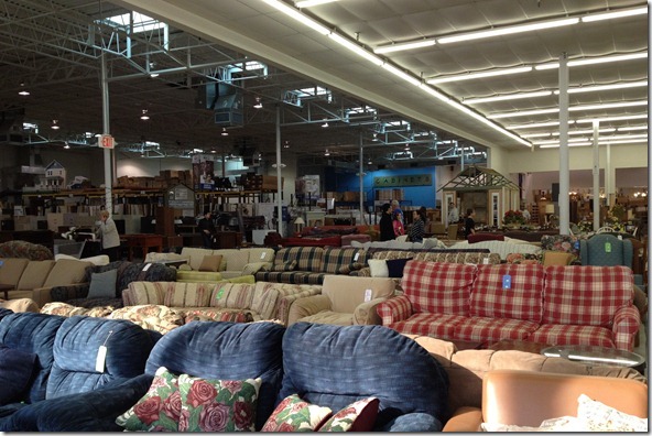
We’ve been hunting for inexpensive but large gold chandeliers for a while.  We finally snagged two at Habitat for Humanity’s Restore.  I’ve never been to Charlotte’s Restore but got the idea from a post on Young House Love.  The moment we walked in, I knew we had hit the jackpot!

 photo 1 (30)

Restore had tons of cool stuff.  Basic and cheap cabinets and drawers, but really nice antique stuff, too.

photo 2 (27)

They did have some junky stuff, though.  A consignment store wouldn’t be complete without a creepy clown – am I right?

photo 3 (8)

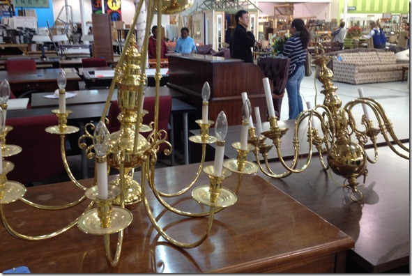
We eventually wandered into the lighting section.  There were lots of great gold chandeliers.  Since we were going to paint them, we paid the most attention to 1) price; 2) size; and 3) shape. 

photo 4 (10)

We ended up getting these two fixtures for $115 and $75.

photo 5 (4)

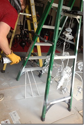
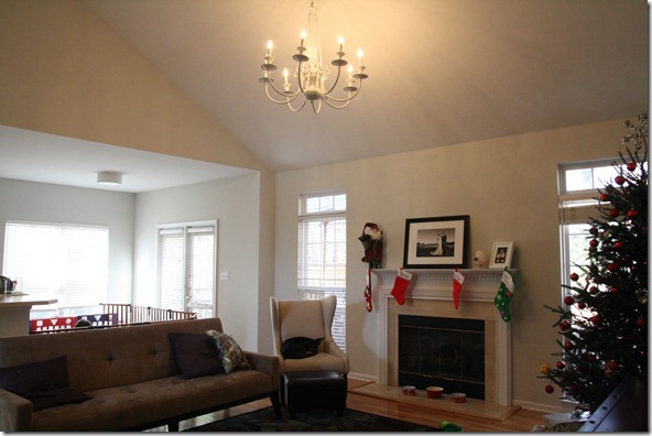
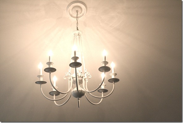
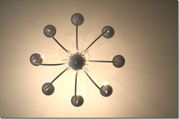
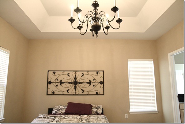
Our living room has a lot of white and grey details, so we opted to paint the largest with a flat white spray paint.  The smaller of the two got the oil rubbed bronze treatment.

photo 1 (32) photo 2 (28)

After letting them fully dry for a few days, we called in a handyman to hang them up.  Our ceilings are a little high, and I just knew it was too much for us to handle.  He ended up making two trips to Home Depot, so this was definitely the right call!


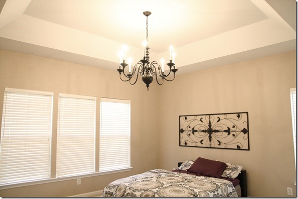
Final result:

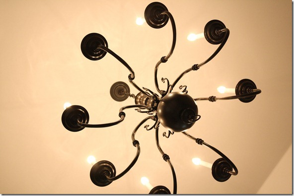
IMG_3447

IMG_3439

IMG_3460

And…

IMG_3458

IMG_3456

The total cost, including handyman fee and all the paint, was around $300.  Not super-cheap but not bad for two HUGE chandeliers. 


In the above bedroom shot, you may notice that the bed now appears really off-center.  It always was off-center from the ceiling, but it was centered between the corner and the window.  Now that there’s a large and in-charge chandelier in the room, it looks really strange.  I don’t want to put the bed under the window, and if it goes on the opposite wall, it will be right next to the door.  Any thoughts on visually resolving this issue?


You guys working on any fun home projects?  Next up:  purchasing a light for our bathroom… I’m so tired of showering in the dark (told you we were seriously lacking overheard lighting in the house!).


Psst – Are you from the San Francisco area?  Do you know some elementary school girls that could really use some awesome, custom-designed sportswear?  Check this out!

{ 46 comments }


  • Natalie @ Free Range Human December 14, 2012, 2:50 pm

    Those look really good. We’re getting ready to re-do our kitchen That will definitely be an adventure!

  • Sonia the Mexigarian December 14, 2012, 2:51 pm

    How about setting the bed angled out from the corner?

    Cute photo of Henry, btw 🙂 He looks pretty darn pleased with himself.

  • Sana December 14, 2012, 2:54 pm

    keep the bed as is! It does not have to be perfect 😉

    • Julie December 19, 2012, 10:46 am

      I agree! I’ve never worried about centering the furniture underneath the overhead lights. I think it looks just fine the way it is.

  • Amanda K. December 14, 2012, 3:05 pm

    it looks great!
    funny thing about my husband: he HATES overhead lights. he insists on using lamps instead. he’ll go through our house turning off lights. funny, huh?
    now that we’ve lived together for awhile i always notice overhead lights vs lamps 🙂

    • Caitlin December 14, 2012, 3:09 pm

      I hate fans 🙂

  • Claire @ Live and Love to Eat December 14, 2012, 3:09 pm

    The Henry photo made me smile amidst all of the sad news today. Thanks for sharing!

    • Caitlin December 14, 2012, 3:09 pm

      I’m glad. My heart hurts SO SO SO much for those families.

  • Ali December 14, 2012, 3:13 pm

    I would center the bed to the middle of the Room and add a small table to the left of it to balance the room…maybe that would work?

  • Nadine December 14, 2012, 3:14 pm

    I think if you added dark night stands to your room , the bed would look more grounded. You wouldn’t notice that it’s off center. Love the metal decoration above the bed!

    • Caitlin December 14, 2012, 3:16 pm

      Oh good idea. All of my nightstands are now at the clinic. 🙂 LOL

  • Liz December 14, 2012, 3:26 pm

    Center the bed on the wall it’s on (it looks like it’d hit right before the window so it won’t block light) and balance the window with a large piece of art on the left. You could even use the metal thing you have turned vertical and then add maybe a row of smaller frames in the middle or a taller headboard. I think night stands would help too.

    • Rachel January 3, 2013, 3:30 pm

      That’s what I was going to suggest! Eyeballing it from the photo, centering the bed wouldn’t cut off any of the window, and then you just need something dramatic on the other side to balance out the window.

  • Reenie December 14, 2012, 3:30 pm

    I don’t think it looks off. Once you find some night stands, and put up curtains or shears, I think it will look more complete. (Not saying you have to do that now….. I know with my home after living there for 10 years, I’m still getting around to getting things done ~ I do them when I can $$$) =)

  • Sarah Jessica Farber December 14, 2012, 3:35 pm

    I would center the bed under the light. Add nightstands to each side of the bed with lamps when you find some you like/can afford. They don’t have to match, but they certainly could be a matched set. Then, I would pretend I had a window that matches the window to the right of your bed on the left. I’d do that by hanging a window treatment there and hanging the same one on the other side (where the actual window is. I’d maybe hang an oil rubbed bronze rod (or a rod you just paint ORB!) about 6 inches above your window and hang a really long curtain. Maybe even something with a contrasting band at the bottom – that would emphasize the height of your ceilings. Hang the rod on the opposite side of the bed at the same height, just leave that curtain closed. Same idea here: http://movingdesignz.blogspot.com/2012/03/quick-makeover.html

    • Jan December 15, 2012, 7:27 pm

      I totally vote for this solution. I’ve done exactly this look in a bedroom. It’s awesome. And inexpensive.

  • D December 14, 2012, 3:40 pm

    I would center the bed on the wall it is currently on.
    Maybe do ceiling to floor curtains on each side of the bed…that way you wouldn’t even see that there was a window there, but could pull the curtain back if you wanted the light or if you wanted air circulation from an open window.

  • Courtney Leigh December 14, 2012, 3:54 pm

    I was originally going to say I agree with Liz, and I do, but Sarah’s idea is pretty awesome too! I mean if you’re getting inspiration from YHL, might as well move your bed right next to a window like they did!

  • Sarah @ Yogi in Action December 14, 2012, 4:03 pm

    Nice chandeliers! I love chandeliers so much- but unfortunately the ceilings in my place aren’t high enough to hang any- unless we want to be bumping out heads on them all the time.

    Also, that picture of Henry is adorable! He looks so happy

  • Ali December 14, 2012, 4:04 pm

    Henry looks adorable in that photo! Do you think the oil rubbed bronze would work on door handles? My entire condo has gold door handles and I HATE them. I just can’t justify the expense of updating them when they work fine!

  • Erika December 14, 2012, 4:05 pm

    Angle the bed?

    I have a photo like that of my son too only with applesauce. Why isn’t it as cute when we adults have food on our face?!

  • Carly December 14, 2012, 4:14 pm

    If you’re not opposed to covering the window, I’ve seen some super cute pictures of people hanging heavy drapes from floor to ceiling across the entirety of the wall behind the bed. Pinterest, baby!

  • Bobbie December 14, 2012, 4:18 pm

    They look great. We have the same Ikea bedspread in our master bedroom! love it!

  • Mary December 14, 2012, 4:48 pm

    I LOL’d at my desk when I saw that pic of Henry, that is priceless. So. Cute.

    Save it FOREVER so you can embarrass him with it at various life events (high school graduation…first serious girlfriend…etc.).

  • Erin Hack December 14, 2012, 4:50 pm

    That adorable picture of Henry is just what I needed after hearing the awful news from CT. He is such a doll and that picture cracks me up!

  • Becca December 14, 2012, 4:50 pm

    Adorable and hilarious photo of Henry! I’m sure you’ll give him an extra hug tonight.

  • Bonnie December 14, 2012, 4:53 pm

    Consider putting floor to ceiling drapes the entire length of the wall and centering the bed. You can’t go wrong. I purchased a new home about 8 years ago and gold fixtures were still “in”. I haven’t replaced them, yet. Recently, a lighting store rep told me gold is coming back.

  • rebecca December 14, 2012, 5:17 pm

    That photo seriously needs to go in some cute baby photo contest!

  • Jenn December 14, 2012, 5:25 pm

    Everyone has the right idea about centering the bed on the wall/light and then creating the illusion of a window on the other side of the bed too. You could buy an antique window and hang it on the wall, or a framed mirror, etc. – something that gives the illusion of a window. Art would work too to balance it out. Just make it the same size and hang in the same place as the real window.

  • Sarah December 14, 2012, 5:53 pm

    If you skooch the bed over toward the window, get some curtains (!), nightstands and lamps, you can balance the non-window side with some tall thin artwork. Actually the piece you have over your bed is the perfect proportion. You could mount it tall-ways to balance out the window and then get something round or organic shaped for over the bed to soften all the rectangles.

  • Wendy December 14, 2012, 6:22 pm

    Henry looks just pleased as punch. I think my heart just melted, he’s too darn cute! Thanks for that pick me up, definitely been quite the week after all the sad news.

  • Katie @ Talk Less, Say More December 14, 2012, 8:01 pm

    Those lights look great!!

  • Kathy K December 14, 2012, 8:11 pm

    I laughed out loud for the first time today seeing that adorable picture of Henry! He is such a cutie pie!

  • Michelle December 14, 2012, 8:22 pm

    It’s amazing what a coat of spray paint will do to something! Love the way these chandeliers turned out. Well done. 🙂

  • jennifer December 14, 2012, 9:12 pm

    are you making. baby food? would love a post about Henry’s transition to food.

    • Caitlin December 15, 2012, 7:29 am

      I will definitely do a post about Baby food soon but we are still trying to figure it out. So far I have tried a few things including purées, baby led weaning, and those little pouches that you can put purées in. Everything he’s had has been homemade except for some Mum Mums.

  • Katie December 15, 2012, 10:30 am

    That picture of Henry might be one of my favorite picutres ever. The look on his face makes the pic!

  • Micky December 15, 2012, 6:54 pm

    I would center the bed and then make a “fake” window and do long curtains on each side of the bed. I would also add nightstands because it looks too bare.

  • Marissa C December 16, 2012, 1:18 am

    Really pretty! But did they really charge over $100 for an old brass chandelier??? You can get one brand new for just a little more at Home Depot.

    • Caitlin December 16, 2012, 10:16 am

      Not that big! It is HUGE.

  • Abby A December 16, 2012, 11:36 am

    Put the bed in the corner! I know it sounds weird, but you can install and corner shelf behind the head of the bed so nothing falls behind:-)

  • Heather December 16, 2012, 1:50 pm

    i think that’s my favorite picture ever of henry. so presh

  • Nancy December 16, 2012, 11:34 pm

    Hi Caitlin!
    I’ve been reading your blog for a month now 🙂 I am 32 weeks and love having the support, advice and ideas to read about in your AWESOME posts!
    I help my clients with decor, and other feng shui-ish things so here’s my take on your visual balance for the bedroom:
    Symmetry creates drama and I love that your chandelier lends itself well to that feeling in the room but I see what you mean. The set up isn’t making the most of any of the elements in the room… Soooo I have 2 suggestions.
    1. The first is to create a large “faux window” behind the bed by attaching a drapery rod as if the window went all the way across the middle section of the wall (leaving a couple of feet on either side of course) so that you’re creating the look of a large window. Hang 4 panels in all; 2 thicker patterned (or solid panel) surrounding 2 sheers. Now you can move the bed to the center of the wall, and in perfect alignment with the chandelier. This also creates a warmer, cozier atmosphere in the room and the supportive feeling a headboard creates behind a bed.
    You can still keep the blinds open and allow some of the light to filter through the drapes. It won’t be too noticeable that you only have a window on the right side. But the room will feel great overall. You can move the decorative metal piece to a different wall.
    2. My other suggestion is to center the bed with the room/ chandelier and replace the wall piece with an asymmetrical grouping of elements such as more metal sculpture in the shape of flowers or a different design and arrange them in an organic shape as though they were blown into the room from the left and behind the bed like bubbles or pussy willow feathers!
    This way the symmetry of your bed contrasted with the obvious asymmetry of the window/ wall decor will look purposeful, and the two can actually balance each other.
    I would personally try the curtain panels since that is a great way to add texture and warmth to the room. Try linen or reg thick, cotton panels and off whites/ whites and crisp patterns or solids for a chic, yet simple organic feel that will add a substantial (rather than frilly) feel to the space.
    Love the bedspread btw!
    Thanks for your blog :))
    Nancy

    • Caitlin December 17, 2012, 6:56 am

      You know your stuff!!! Thank you for reading 🙂

  • Jolene (www.everydayfoodie.ca) December 17, 2012, 11:20 pm

    OMG – He is just too cute!!!!!

Healthy Tipping Point