Big or Small

in All Posts

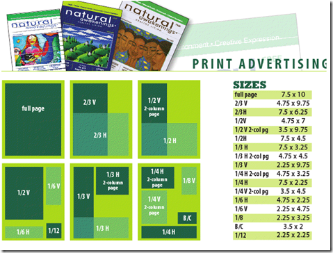
The Husband and I have been staring at ad rates for Natural Awakening magazine for over an hour, trying to decide how big of an ad we should take out for his clinic.

Untitled

Do we go big or go home? Be frugal? Go for a splashy color ad or simple black and white?


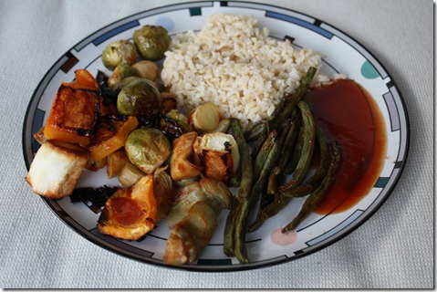
Beyond business debates from the couch, the Husband also made dinner:

IMG_1815

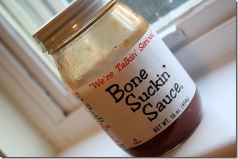
The star of dinner was this wonderful BBQ sauce:

IMG_1811

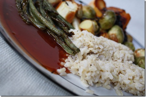
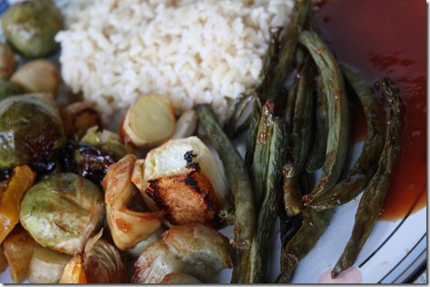
Which I drizzled all over roasted vegetables (parsnips, Brussel sprouts, beans, butternut squash, and artichokes).  A simple dinner, but it hit the spot.

IMG_1816

IMG_1814

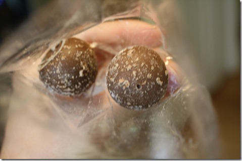
And dessert was two little truffles, which I saved from my trip to Chicago earlier in the month:

IMG_1807

Let’s see…


I’m feeling so beat because the Husband and I went to Power Mixed yoga tonight.  It was nice, but now I’m wiped.  And I feel permanently dehydrated despite chugging tons of water.


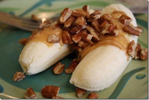
Pre-yoga snack was a banana, PB, and pecans:

IMG_1809

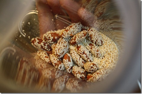
And after, I randomly munched on a ton of almonds as I wrapped up a freelance article.

IMG_1810

Back to the raging debate over ad sizes…


PS – Still hungry and eating chips and hummus.

{ 91 comments }


  • Lindsey @ Gingerbread Bagels September 7, 2010, 8:44 pm

    Hmm I’m not sure which ad size to choose? So many choices! By the way I LOVE that BBQ sauce, I usually get the thicker style. It’s amazing 🙂

  • Aimee Lin September 7, 2010, 8:44 pm

    My comment doesn’t have anything to do with your current post. 🙂 I was reading my Glamour magazine and saw an article about you. Very cool! That is so amazing that you had a book published, have been on TV, in magazines, etc. Congratulations on your success!

    • Caitlin September 7, 2010, 8:53 pm

      I feel very blessed. Thanks!

  • claire September 7, 2010, 8:47 pm

    Have you guys read the book Guerilla Marketing?

    I’ve not read it, but Dave Ramsey always recommends it to small business owners who are starting out or trying to increase visibility and revenue. The book is full of inexpensive ways to market your business.

    • Caitlin September 7, 2010, 8:54 pm

      I just ordered it, thanks for the recommendation!

  • Brittany (A Healthy Slice of Life) September 7, 2010, 8:47 pm

    I think the placement in the magazine would be important to look at… if you are on the front or back cover, a smaller ad would do. And how often does the magazine come out?

    I used to be in advertising so it always peaks my interest to see what advertising mediums people choose and why… keep us updated 🙂

  • Kristy @ KristyRuns.com September 7, 2010, 8:51 pm

    I don’t know why, but the banana, pb, and pecans looks like such a yummy combo! Must. Try. 😉
    Can your husband come teach my husband how to cook dinner? Please? 🙂

  • Samantha @ Food Edu September 7, 2010, 8:53 pm

    If you think your hubs will generate a lot of business from the big ad–I’d say go big. Or maybe start with a small ad and see how the return on investment is. Ads can be ridiculous expensive.

  • A. White September 7, 2010, 8:54 pm

    I have never commented before, but as a person in the print advertising biz, if you can afford the larger space I say go for it. The larger size with full color will help people perceive you as a major player (think, major companies in national magazines) while a smaller ad will give the perception that you are a smaller player in your industry,and possibly get lost in the clutter. Even if you are not yet, always try to give the impression you are the biggest and best there is!!!

  • Jessica @ The Process of Healing September 7, 2010, 8:56 pm

    Oh I’ve heard that sauce is delicious!!!
    And I’d say go for somewhere in the middle, as for the ads… not too big, not too small..

  • Kim September 7, 2010, 8:57 pm

    I’ve never seen a banana look so amazing!

  • Kelly September 7, 2010, 8:57 pm

    I think the bigger the better for your ad, but whatever you can afford is obviously the best choice for you 😉 I really wish you tons of luck!

  • Evan Thomas September 7, 2010, 8:59 pm

    I think a simple, clean, colorful ad that grasps your eye is just as good as a full paged, dowdy, lackluster ad. So go small, but go big!

  • Callie @ Callieflower Kitchen September 7, 2010, 9:02 pm

    I personally think that the 1/2H ads work the best on me – I flip right past whole-page ads because there’s nothing I’m going to read on it, but I usually notice the 1/2H ads on pages that I’m already reading 🙂

  • amanda @ fake ginger September 7, 2010, 9:03 pm

    I think bigger and colorful is the way to go!

    That banana looks so good right now. I wish my bananas would hurry up and ripen!

  • Tina September 7, 2010, 9:05 pm

    It’s so hard to know what’s the best thing to draw people in. I say you wouldn’t need a full page ad…but something still noticeable. I think a 1/2 would be good. And color is of utmost importance in my opinion. So if you have to choose either a smaller color ad or a larger B&W I would go with the color option.

  • Tina September 7, 2010, 9:06 pm

    Look forward to the book update!

    And I love track workouts. I did so many sprints and stadium stairs at one during my fitness competition prep the end of last year.

    • Tina September 7, 2010, 9:06 pm

      Oh my goodness!!! Sorry for posting this here, Caitlin. LOL I still had your page open and was also replying to Tina’s site. It’s been one of those days. LOL

  • Dynamics September 7, 2010, 9:06 pm

    Being new to the community, I would think an ad all you yourself on one page. After that, you can cut it to a smaller size just to remind people you are there.

  • eri September 7, 2010, 9:09 pm

    i agree w/callie’s comment about the 1/2 ads. i tend to notice the ad more if i’m already looking at stuff on the page, as opposed to the full page ads that i just flip past.

  • Sarah September 7, 2010, 9:09 pm

    I’ve sold advertising for a long time and I would definitely suggest going as big as you can afford and colour – black and white often gets lost on the page. Saying that though it is better to spread your money over a series of ads rather that one big one, you need to be seen continuously to get a good response. Good luck!

  • Lisa @ Early Morning Run September 7, 2010, 9:10 pm

    My 2 cents re: advertising. If you go with a small ad, go with color. A small b&w will be passed over so quickly it won’t be worth it.

    Your snack looks delicious!

  • Effy September 7, 2010, 9:18 pm

    I finally checked out the new clinic website, and as a tech savvy consumer, I would suggest you get official e-mail addresses with the holisticcharlotte.com domain name. It is much more professional than using a yahoo account, and some people (like me) pay attention to the details. Good luck on the new venture!

    • Amy September 7, 2010, 10:15 pm

      I totally agree with this comment!

      Apparently other people feel the same way:
      http://theoatmeal.com/comics/email_address
      😉

      • Caitlin September 8, 2010, 10:08 am

        I’ll notify the husband.

  • Morgan @ Healthy Happy Place September 7, 2010, 9:19 pm

    We’ve looked into way too many advertisement rates for our small business…i know your head is probably spinning!

  • Camille September 7, 2010, 9:20 pm

    I would opt for the big flashy ad off the bat and then switch to a more subtle one once he has established a foundation!

  • Alyssa September 7, 2010, 9:24 pm

    I would definitely say color! It draws the eye and grabs people’s attention, know what I mean? I think it would make a big difference, but that’s just my opinion. I’m sure the clinic will be successful no matter what 🙂

  • diana @ i can eat, can't i? September 7, 2010, 9:26 pm

    hmm.. always go big and color-attention!

    i love that bone sucking sauce! sounds like bbq has been naughty haha!

  • Caitlin September 7, 2010, 9:27 pm

    I envy your butternut squash! That looks like a great dinner.

  • Michelle @ Give Me the Almond Butter September 7, 2010, 9:29 pm

    If you can, go big.

    Your dinner looks excellent. Some of my favorite dinners are those very simple ones.

  • Nikki @ Balance and Moderation September 7, 2010, 9:38 pm

    I used to post a lot of ads for recruitment and I found that you really get what you pay for. Did you ask the magazine for their stats on the advertisements (if they have any)? Usually the sales rep (if they are honest) will tell you the best value. Also, make sure to get a deal – they will generally knock off a few bucks if you ask.

  • Erin September 7, 2010, 9:42 pm

    Go for the right side of the page, it’s proven that’s where people look first and usually only glance at the left side quickly, if they even look at it. You’ll get more exposure there. As for size, bigger is better but you if you want to go with a 1/2 or 1/3 go with the top of the page, that’s where people’s eyes are naturally drawn to.

  • BethT September 7, 2010, 9:43 pm

    I also place a lot of ads for my job and go for a minimum 1/4 or 1/3 page. Color is good but not always necessary. Also, if it works for your budget to place a small ad more frequently (versus a huge ad only one time), I’d go that route.

  • alicia September 7, 2010, 9:43 pm

    I just wanted to add on to some of the comments about the ad in the magazine. Go for color – b&w will definitely get lost in the clutter. Depending on your budget it might make sense to do a 1/2 or even a 1/4 page ad in color….and see if they may give a discount if your ad runs in more than one issue? If they won’t negotiate with you on price, see if they will give you any ‘added value’ such as extensions to their website that will drive to your business website.

    hope it helps! – you can email me if you have any Q’s!

  • ari September 7, 2010, 9:49 pm

    i wouldn’t go all out.
    i’ll tell you a story as to why 🙂
    so, my dad sells insurance for agriculture, like for plants on nurseries. and he has two cars, a jeep and a bmw (he had to sell the bmw a while ago because of the economy). but he would only ever drive the jeep to work, and when i asked why he said, “i don’t want my clients or potential clients to think that i’m doing well enough without their business, that i don’t need their business.”

    BUT i guess it could work both ways in that if you can afford to have a big ad, then your business is doing well and your services must be good. soooo i guess this comment wasn’t really much help HAH.

    • Caitlin September 8, 2010, 10:07 am

      haha funny story. 😉

  • ashleigh September 7, 2010, 9:52 pm

    Mmm truffles! Good luck with the ad placement!

  • Ashlee September 7, 2010, 9:52 pm

    I would not have been able to wait until now to eat those truffles! I would have probably eaten them on the plane ride home!

  • Heather September 7, 2010, 9:52 pm

    making decisions about how much to spend on advertising is SO difficult! we ran into that with my husbands law firm he opened. good luck!

  • Jean@RoastedRootsPumpkinSpice September 7, 2010, 9:54 pm

    I love the name of that BBQ sauce! Very funny. 😀

  • Chelsey September 7, 2010, 9:54 pm

    I think you should go big or go home. I’m kind of an extremist though, so my opinion could be totally moot.

    That dinner looks amazing… and your snacks are making me hungray!

  • emily September 7, 2010, 9:56 pm

    I vote half page, sometimes full pagers seem like they are trying to hard; it’s like an overeager first date! 🙂

  • Tracey @ I'm Not Superhuman September 7, 2010, 9:56 pm

    In my opinion, Anything smaller than a 1/2 or 1/4 vertical or horizontal is pointless. I think horizontals are easier to pick out against text than verticals, but I think that’s because they’re more prevalent in magazines so readers are used to them–and they’re easier to skip over. Aside from full page ads, which are obviously ideal, I think a 1/2 horizontal still grabs attention.

  • Laura September 7, 2010, 9:57 pm

    I would start with a half page. The horizontal ones are more visually appealing. But it all comes down to cost of course. Maybe start with a half page then you can go either up or down, whichever would work best!

  • Kelly September 7, 2010, 10:00 pm

    From my (limited) small business ad making experience, I would say at least 1/4 page – but you definitely don’t need a full page. Also, I would say definitely go for color, its worth the extra cost in my opinion.

    Also, don’t be afraid to attempt negotiation with the magazine. The economy is not good right now, and everyone knows it. Sometimes that can work to your advantage.

    Good luck! 🙂

  • Gabriela @ Une Vie Saine September 7, 2010, 10:01 pm

    I say go big but simple- even if it’s just half a page, a cleaner look is always more appealing to me!!

  • Haley September 7, 2010, 10:10 pm

    definitely go big or go home with this one… I always think the more you put yourself out there, the greater your rewards will be.

    And I’ve seen that BBQ sauce in markets around here… we LOVE bbq sauce so I’ve been wondering how it is. Good to hear you like it… I just might try it soon.

  • Stacy September 7, 2010, 10:12 pm

    I see you’ve already received a good amount of feedback on the ad thing! I work in advertising/marketing so thought it might be helpful to give my 2 cents as well 🙂
    I would say go with the full or half page (depending on what you feel comfortable with cost-wise) and definitely color. Color just pops! Take a look at the publication and the ads that are in it- if they’re mostly B&W, a color ad will definitely stand out, and if they’re mostly color you don’t want to be the blah B&W ad amongst them.
    I’m not familiar with the magazine, but if it’s not a local publication they might have geographic zones you can run in specifically, so you aren’t paying for placing the ad in an area too far from the clinic.
    It’s also worth checking with the publication to see if they offer a discounted rate if you commit to running the ad more than once, and if they’re willing to offer you any type of value add (ad space on their website or link to the clinic site from their website, etc).
    Best of luck! I’ve always wanted to try accupuncture, I find it fascinating 🙂

  • Stacey September 7, 2010, 10:15 pm

    🙁 I try to get Jason to go to yoga with me, but he isn’t very flexible! Ugh decisions, decisions..do what feels best for the business <–I know that's crappy adivce lol, sorry!
    BTW–we have the Bone Suckin' Sauce in our house too and it totally ROCKS 😀

  • holly @ couchpotatoathlete September 7, 2010, 10:20 pm

    Sorry I have no feedback on the ads — I would take out a “medium” sized one to start and see where that leads you.

    I’d get a bunch of books and take the advice from there — good luck in what you both choose to do!

  • Cyndi Eggers September 7, 2010, 10:30 pm

    I’m a graphic designer… would love to help design a campaign if you’re in need. My portfolio could use something new and current so we can trade creativity for final product. Do you have any ideas as far as concept? So much can be done with holistic medicine and acupuncture. Something to help the clinic stand out right off the bat and then carry through future ads would draw interest and begin creating the recognition you’re looking for. I can email samples of past work if you like.

  • christina cadden September 7, 2010, 10:39 pm

    That banana looks delicious!

  • Nadine September 7, 2010, 10:49 pm

    Hi,

    You’ve got lots of comments already, but I’ll add to it. You need to have a series of ads to resonate with the consumer and to start building brand awareness. I would do color and a series of 1/3 or 1/4 page vertical. Vertical ads seem to be more effective. Keep the message simple, but compelling. Digital advertising is sometimes just as effective, and less expensive.

    One last comment, the cost of treatment seems high. I am sure you competitive, but I think it’s too high for someone who’s new to this type of medicine. I would tie the ad in with some sort of doubting Thomas promotion.

    I hope this helps!

    • Caitlin September 8, 2010, 10:12 am

      We’re going to run a coupon with the ad. Good idea!

      But just an FYI, the cost of treatment is on the lower end for our area. Licensed Acupuncturists go to graduate school for 4 years… it’s worth it!

      • Nadine September 8, 2010, 10:27 am

        Completely understand about the cost of treatment and the time/cost of becoming a licensed professional. As someone not familiar with acupuncture, the cost might make me think twice, but a coupon is great! That way you can also gauge the effectiveness of the ad.

  • Leah @ L4L September 7, 2010, 11:01 pm

    I used to work in print advertising. I hated the sales pressure but I would def say you have to have color. And at least 1/4 page to even catch someones attention for a millisecond. Definitely negotiate the price. And run it for more than just 1 cycle. It’s also good to have a promotion with it. That’ll get people on the fence to commit to at least once. Then it’s your husbands job to retain that business.

  • Susan@MomSwimBikeRun September 7, 2010, 11:02 pm

    Go big or go home. Do the big ad!

    • kate September 7, 2010, 11:11 pm

      Im with Susan!

  • Ellen@FirednFabulous September 7, 2010, 11:18 pm

    Ohh that banana looks might tasty right now! Mmm. Great combo. And sorry, I’m so indecisive, I’m not help on the ad front! Good luck 🙂

  • Jasmine @ Eat Move Write September 7, 2010, 11:23 pm

    I worked in marketing for several years before I left to become a freelance writer. I generally advised my companies to purchase 1/2V two column or 1/2H ads or full page. Anything smaller is a waste of your money and 2/3 is just as good as 1/2 visually. Request for them to put the ad in the first 25-30 percent of the magazine and to put the ad on a right hand page if possible. This will get you better visability. 🙂 Good luck! xo

  • ida September 7, 2010, 11:35 pm

    I would think smaller is ok if it’s on the right part of the page. Not sure where the eye goes 1st, but a small ad there might be just as effective as a large one. No point in paying for blank space. But i’m sure you guys have done lots of research on what gets the most attention… good luck!

  • Chelsea @ Strawberry Sweat September 7, 2010, 11:40 pm

    Wow, with all this activity you’ve been doing lately, I can imagine that you are hungry all the time! I know I would be!

  • nancy September 8, 2010, 12:10 am

    I agree, lots of activity – I’m sure you will have a speedy race this weekend! I’m doing the Irongirl 10K in Seattle with my sister!!!!!

  • Katherine @ Left Coast Contessa September 8, 2010, 12:13 am

    I would say maybe sometime in the middle of big and small!

  • Valerie Gunther September 8, 2010, 12:39 am

    Love the blog, and the food pictures. You have inspired me to cook B. sprouts tomorrow. Also we have something in common, my husband is finishing his last year of Chiropractic school. 🙂 When training for a marathon its so nice to have “good care” around. 🙂

  • Kim@EatandBe September 8, 2010, 12:40 am

    Hi Caitlin,
    My husband and I also own a small business and after 5 yrs. of marketing experience my advice would be go small, black adn white. People tend to read business card-sized ads just as frequently as big, colorful ads. Also, check out Timothy Ferris’ book, The 4 Hour WorkWeek as another businses marketing idea resource.
    P.S. your banana/cashew picture is beautiful!

  • Mastering Public Health (@MasPublicHealth) September 8, 2010, 12:59 am

    I read Natural Awakenings every month in my area. In my opinion, 1/3H (or if you’re feeling bold, 1/2V) is perfectly adequate and nice for that kind of ad! I’ve sen many similar ones look great in that size.

  • Kristina @ spabettie September 8, 2010, 1:39 am

    If you are set on Natural Awakenings, I would start small and then assess how well it is received… it is a regional publication, and I chose not to use it as it brought no biz (I have many tracking plans) but it could be different in your area… we have many like minded publications, being in a natural medicine mecca.

    In any case, regardless of readership, an ad is an ad, content is more impressive than size IMHO. 🙂 and I never publish an ad without a “call to action” <–wow, business school!! meaning an offer or something to bring them in. 🙂

  • michelle September 8, 2010, 2:26 am

    Hi Caitlin!

    I worked in magazine publishing for awhile and the rule of thumb is go with whatever you can afford for the long haul. Magazine ads are VERY useful, but it takes at least seven issues for most readers to act upon an ad. That’s a lot…but it is absolutely necessary and will pay dividends in the long haul. You can use cheaper forms of advertising to get your initial (cheaper) clients, but magazines will bring in the people with money.

    It’s hard to say, but you just have to spend the money to see the results you want. Also, make SURE you bargain with the magazine. Even the big magazines have tons of flex room in their prices. Don’t ever let them fool you into thinking they don’t, especially in this economy. 🙂

    And, one last thing, I think your success story is AMAZING. I’ve been reading for a long time now and bought your book. Tonight’s the first night I’ve commented because I feel like I have something to help YOU for a change.

    Thanks,
    Michelle

    • Caitlin September 8, 2010, 9:55 am

      Thanks Michelle for your advice!!! I’ll pass it on to the hubbers.

  • Christie {Honoring Health} September 8, 2010, 6:39 am

    I’ll be interested in knowing what you decide, I am thinking of advertising in our Natural Awakenings for my holistic health coaching business. I have been reading it for years and most recently scoping it out to see what is in there and the list of holistic health coaches is nada so I could corner in on that market. But, as one of the commenters said above, I am not sure if I have that kind of money for the long haul.

  • Nicole, RD September 8, 2010, 7:43 am

    That’s a hard decision. I say middle of the road. Too small gets missed, too big is probably too expensive for the benefit.

  • Anna September 8, 2010, 8:52 am

    http://www.kristofcreative.com/learning/advertising/magazine-ad-effectivness.shtml

    ^^ Interesting article on the effectiveness of print ads (including the top 10 most effective placements, sizes, and use of color). Just thought you’d like it if you haven’t already made a decision. It pays to do your homework! 🙂

    • Caitlin September 8, 2010, 9:58 am

      That was really helpful! Thanks!

  • Chelsea @ One Healthy Munchkin September 8, 2010, 8:52 am

    Definitely go for colour! And I’m thinking at least a 1/3 of a page. Anything smaller and I tend to overlook it when I’m reading a magazine. Hope that helps! 🙂

  • Liz @ Blog is the New Black September 8, 2010, 8:55 am

    I’ve been doing yoga, too, at home, and cannot believe the workouts I am getting!!!

  • Darci September 8, 2010, 8:59 am

    color ads always catch my attention! and sometimes the HUGE ones are annoying! good luck 🙂

    i still haven’t tried yoga…need to get on that.

  • Sarah @ Sarah's Shaping Up September 8, 2010, 9:16 am

    I say go big or go home. 🙂

  • Erin September 8, 2010, 9:22 am

    I work in advertising and we always recommend clients do small ads more often then a large ad only once. Frequency works better than anything else. Also, as for b/w vs. color- it really depends what the rest of the magazine looks like. If everyone else has ads that are in color you should go with black and white to make it stand out and vice versa. You want to be towards the front and on the right hand side.

    Also, if you act interested but say the cost is too much and you really need them to work within your budget you can ALWAYS get them to come down on pricing. Especially if you say that you are willing to commit to more than one run…in their eyes they see more revenue!

    • Caitlin September 8, 2010, 9:58 am

      Hmmm interesting. I will try to haggle!

  • Orla September 8, 2010, 9:27 am

    Just throwing in my 2 cents worth!
    I would not go smaller than 1/4 page and would definately go full colour, no clutter and website/contact numbers clearly visible. Nothing more annoying than contact details being small font and having to squint for them! Will make me turn the page very quickly.
    Another thing is to bargain with the publication – what added value are they offering – all advertisers are offering deals at the moment – what are their sister publications and can they do a 2-for-1 in that publication?
    Thirdly, ask them for testimonials from similar sized companies. Genuine and honest advertisers will have no problem in handing over those details (obviously from companies who have given their permission to have details shared)
    THen speak to a similar startup (in a different field or speciality obviously) and ask them their experience, and rate of return from the advert.
    Unfortunately, there is no golden ticket for advertising. What works one month may not the next.
    Just don’t be afraid to ask and to bargain. THe worst they can say is no!
    Best of luck with it all!

    • Caitlin September 8, 2010, 9:59 am

      Thanks!!!

  • Chelsea @ healthsea September 8, 2010, 9:31 am

    From my very limited exposure to yearbook days, I’d say you can be fine with 1/4 of a page as long as it’s color and an eye-catching ad. 🙂

  • Amanda @ LessonsInModeration September 8, 2010, 9:41 am

    Always go color and don’t go less than 1/2 page. Clearly full page is best, but budgets don’t always allow it. If you get the smaller ad size work with your ad rep to get better placement in the publication. Also, make sure you are consistant. I think it’s better to stick with the 1/2 page and run it for at least 3-6 months than a one or two time full page ad.

  • Bianca @ Confessions of a Chocoholic September 8, 2010, 10:08 am

    I love that bone scukin sauce!
    PS – go full color with your ad. Also, consider Facebook ads – they’re cheap and can be tailored specifically to your target audience!

  • Marci September 8, 2010, 12:03 pm

    I agree with #7. Tell them you’re a major player if you can afford it. Or compromise and do 3/4 size more frequently. 3/4 size doesn’t have anything as prominent so it’s almost like having a full page with the same benefits. Def. color. And agree with domain name email address!

  • Jacquelynn September 8, 2010, 1:39 pm

    The vegetable dish looked so yummy! Also, the banana snack was perfect… Have you ever tried dates with peanut butter? I like them for pre-workout energizing snacks.

  • Sana September 8, 2010, 3:38 pm

    Go big or go home!!!

  • Jolene (www.everydayfoodie.ca) September 9, 2010, 12:45 am

    GO BIG!!! Big investments result in BIG rewards!!!

  • Halley (Blunder Construction) September 9, 2010, 12:02 pm

    Bone Suckin’ + Me = Happy! No fat, no sugar!?! Love it!

Previous post:

Next post:

Healthy Tipping Point