If you have already preordered the Operation Beautiful: For Best Friends kids’ book (thank you!), you may have gotten an e-mail alert from Amazon stating that the book’s release has been pushed from July to December. (Side note: This is not to be confused with the Healthy Tipping Point book, which is coming out on May 1 – so soon!) A few people have asked me why the book’s release was pushed back, and the answer is… it’s complicated. And actually, not only is the book’s release date changing, but the title AND the cover is changing, too!
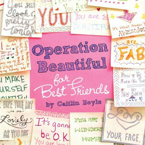
I’m sad this will no longer be the cover – it is so eye-catching – but I’ve seen the draft of the new cover and love it, too.
When I first got into book-writing, there was a lot that I just didn’t understand about the process. This is natural – as readers and consumers, we aren’t usually privy to the behind-the-scenes world of book publishing. Some little-known truths: Authors usually don’t get the name their books. Authors don’t get to design covers. Authors get paid to write a book but don’t necessarily get paid every time someone buys a book (they earn royalties if a book sells a very high ‘goal’ number of copies; I have never gotten a royalty check!).
So – why did Operation Beautiful: For Best Friends get pushed back, retitled, and redesigned? Well, my friends, that is quite the story. Here to give you a little insight, both on my book and other books, is my editor, Laura Marchesani, and my literary agent, Chris Park.
First up: Chris Park
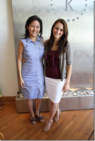
Hi HTP readers, I’m Chris Park, Caitlin’s literary agent at Foundry Literary + Media. I’m feeling a little out of place since the only running I currently do is after a tennis ball or a toddler (what can I say, I’m a wimp! I can’t handle shin splints..), but maybe my status as an early adopter of flaxseed and soy milk (thanks, Mom) will win me some points here. ![]()
As already stated, I’m a literary agent, but for ten years prior to agenting, I worked on the publishing side, mostly in editorial. So you’ll see I draw a lot from that experience. Let’s dive right in with an oft-asked question about the publishing process: How much influence does an author have on the title and cover of her book?
You’d think the author would have executive powers over the title of her own book. You’d think, but you’d be wrong! In most cases, the best we can negotiate is consultation on the title and cover. The publisher includes the author and her agent in the process of selecting a title and a cover, but in the end, the publisher has the final say (there are a few big exceptions, like if your last name is Grisham or Patterson, in which case you do get actual approval). As an editor, I spent a lot of time in meetings in which the powers-that-be debated these details back and forth. Sometimes, these meetings were productive. Other times, there were simply too many cooks in the kitchen. In the best scenarios, the author does benefit from the expertise of the publisher’s sales team and marketing team, who on a daily basis see which titles and covers succeed in the market and can speak to why an idea that seems great to us as individuals may not be the best one to put on the cover. We like to say, “Don’t judge a book by its cover,†but the reality is that in the publishing world, we all do! It’s the publisher’s job to ensure that the book ends up with the cover that does the best job of getting people to pick it up and buy it.
Sometimes, even after the publisher and the author have agreed on a cover they both love, the design doesn’t go over well with the sales team (this is what happened with Caitlin’s book). When the salesperson comes back and says, “So-and-so buyer at such-and-such account hated this cover, and will only take 2,000 copies instead of the projected 10,000 copies,†the publishing team has to take a step back and re-evaluate the situation. A real-life example I witnessed: a great debut novel inspires a publisher to spend thousands of dollars on a photo shoot to produce a charming cover featuring a lovely bathroom and a toilet – photographed open with its seat up. The buyer (from a big chain store you all know) says, “It’s cute, and I want to support this book, but I don’t think people want to pick up a book with an open toilet on the cover. Please rethink this.†The publisher reconsiders, knows that the chain will order more copies if the cover is changed, and settles on a nice, if generic, image of a man in a suit. The chain does come in for a healthy buy, but the book doesn’t end up selling well. Should they have stuck with the more interesting, provocative cover with the hopes that more people would pick it up? Perhaps. But it’s a difficult decision to make.
I always advise my authors to provide their input early and in as much detail as possible – submitting a list of book covers they like, fonts they love, images that could serve as inspiration for the art director. It’s much easier for the publisher to take the author’s suggestions into consideration at the beginning of the creative process than to do so after they’ve already designed three covers. Recently, one of my authors created a board on Pinterest that incorporated all of her likes and cover requests for the designer – brilliant!
Another of my authors just published an incredible memoir – about growing up with two deaf parents and struggling to come to terms with a father who nearly killed her mother – that initially went out to publishers with the title Love, Daddy. It made sense from an editorial perspective, since the memoir included letters her father sent her from prison that were signed Love, Daddy, but the publisher pointed out that it kind of made it sound like a story involving incest! Yeah… probably best not go in that direction. So, we began a long and arduous process of brainstorming and generating a new title. The author, her editor, and I tossed around ideas (I contributed gems like Give Me a Sign and Sign Me Up) and after a lot of agonizing settled on Burn Down the Ground – a reference to a scene in which her family sets their land on fire and her mother says, “We have to burn it so the grass can grow from scratch. It can’t be pretty without being burnt first.†Beautiful and evocative. That’s an example of a situation in which the editor and publisher did a great job of working alongside the author to generate the best title and cover for her story – a true instance of consultation.
~~~~~~~~~~~~~~~~~~~~~~
And here’s my editor, Laura, to discuss what exactly happened with the Operation Beautiful: For Best Friends book!
My name is Laura Marchesani, and I’m an associate editor in the Penguin Young Readers Group, and Caitlin’s editor for Operation Beautiful. I’m also an avid runner and long-time Healthy Tipping Point reader, so it’s been exciting for me to work with Caitlin on her book! Getting a book from the manuscript stage to print is a lot more complicated than you would think. Some books I work on are ready to print after only a few months, but some—like Caitlin’s—require a bit more time and love because the interior design is so complicated. Plus, Operation Beautiful: For Best Friends isn’t just ANY book—I’m a huge believer in the message of Operation Beautiful, so I wanted to be sure to do the best possible job I could on the book.
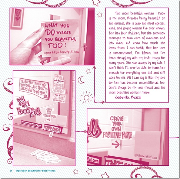
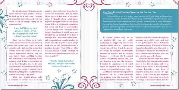
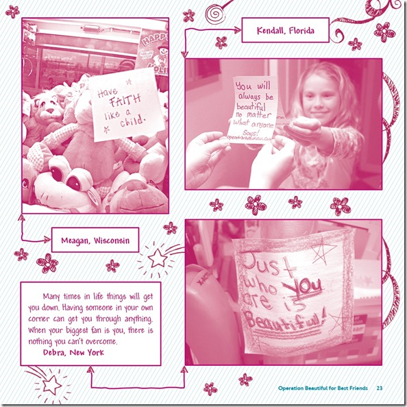
So far, the process of getting Operation Beautiful published has taken almost two years! I first reached out to Caitlin about the project in October 2010, and after negotiating, signing a contract, and finalizing the legal release forms for the kids who were going to appear in the book, she got to work on writing the book in December 2010. Caitlin had about four months to write the first draft, and after I received her manuscript, I edited it and passed it back to her for a revision, which took her about another month. Once Caitlin’s manuscript was final, a copyeditor and fact-checker also had a look at it (adding another few months to the timetable), and it passed to design. The interior of the book is very cool—it was designed to look a bit like a journal or workbook, and there are some great hand-drawn illustrations inside. Here’s a sneak peek of what the inside of the book will look like:
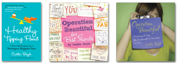
The designer who worked on the book is immensely talented, and it took her a while to lay out the entire interior and organize it in a way that made sense and was easy for kids to read. It also took us a while to design the cover. Initially, the cover featured a border of Operation Beautiful notes. Those were actually written by the people who work in my department at Penguin! I asked my coworkers to each write a note because I wanted the cover to feature a variety of different messages and styles of handwriting. Needless to say, my coworkers were happy to do it, and it made them just as excited about the book as I was.
At this point we were thrilled—we had a cover that we loved, the interior was fully designed, and we even managed to squeeze in a letter from Molly Barker, founder of Girls on the Run, at the very last minute. The book was just about to go to the printer when we got some feedback from our sales team about the cover. They were out in the field, selling in the book to various bookstore chains, and had received comments that some stores wanted our cover to appear a bit older and “less busy.†Of course, this wasn’t ideal, but we knew how important it was to have the support of the major book chains. Customers can’t buy the book unless the stores carry it—makes sense, right?
But in order to change the cover, we’d need to add time to the schedule and change the on-sale date. So we made the decision to change both the on-sale date and the cover. It was a win-win, because not only would this give us the time to make the changes we needed to make to the cover, but it would also give our sales team the opportunity to present it to the buyers at the bookstores all over again. The book was initially on sale in Summer 2012, and we were planning to tie it into back-to-school promotions. Now it’s on sale in Winter 2013, and we’re tying it into “New Year, New You†promotions. This is something that’s pretty common in publishing. In order to get a little more attention and shelf space, we think about major events and holidays that bookstores like Barnes and Noble promote in their stores. Around New Year’s, stores often promote books focused on lifestyle changes, diet/exercise, New Year’s resolutions, and positive self-image. Caitlin’s book targets subjects like lifestyle changes and positive self-image for kids, which makes it the perfect candidate for this promotion season.
As I type this, we’re busy making our final changes to the cover (which I think looks even better than the original!). It’s been a really fun and challenging experience for me to work on Caitlin’s book, especially because, as I mentioned earlier, I believe so strongly in this book and its message. It’s one of the books that I am most proud to have worked on in my publishing career so far. I found that editing Caitlin’s book actually put me in a better mood for the rest of the day—I couldn’t help but think more positively about myself! It also inspired me to leave a ton of Operation Beautiful notes around the office and at the gym. I hope that once you read the book you’ll feel the same way. And please, if you can, share this book with all the little girls in your life. The messages inside about body image, bullying, how to deal with friends and family, and confidence are so important for growing girls to hear.
And for more behind-the-scenes info… Check out “How I Got Published!†– Five Different Perspectives on the Process
What’s your favorite book cover? I know this seems a bit corny, but I love the covers for all the Harry Potter books – they are so fun to look at! And, of course, the quintessential Harry Potter font is great.


I agree, I LOVE the harry potter covers, the art used on the covers and at the beginning of the chapters is beautiful!